Marumi
Marumi is a Sushi restaurant located in the city of Lechería, Venezuela.
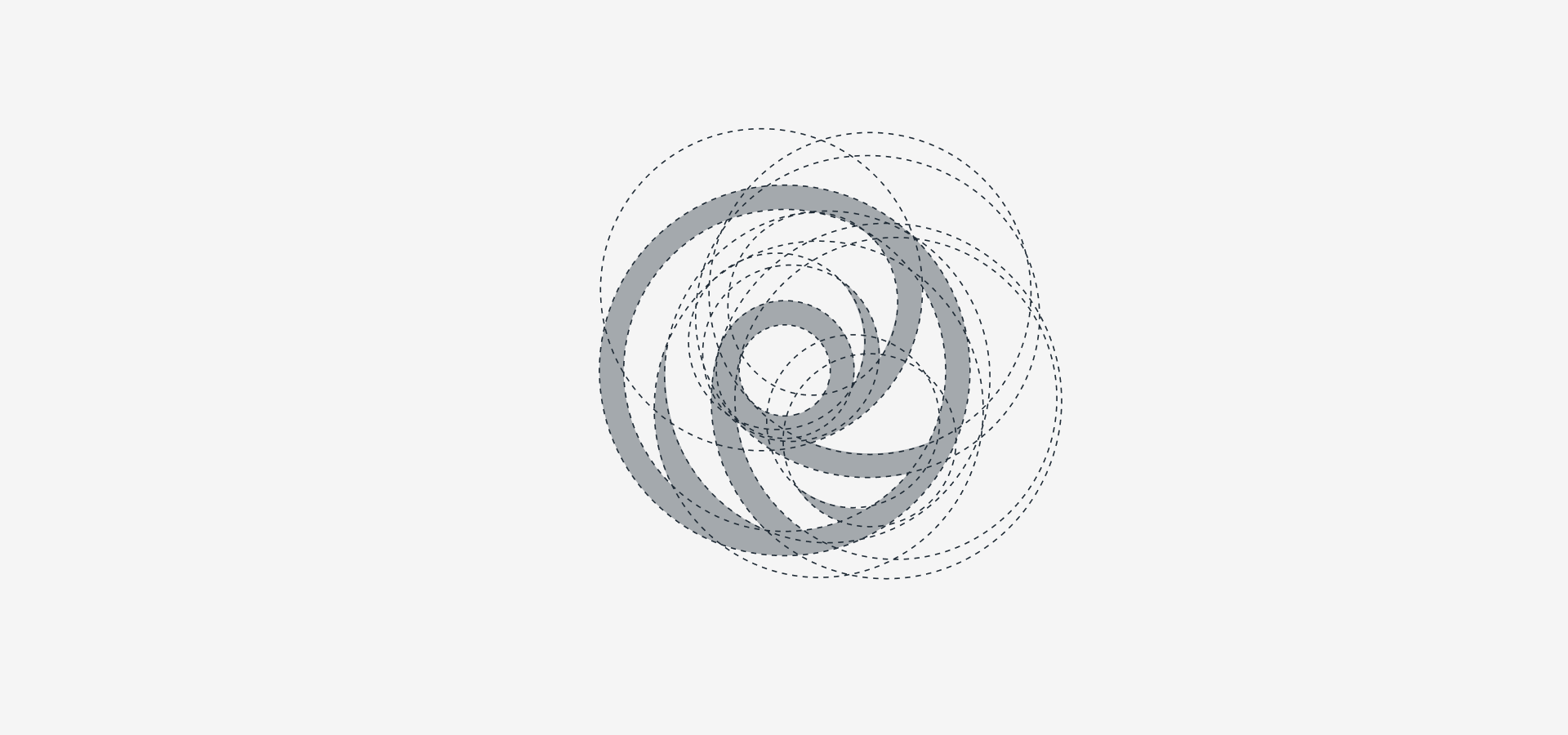
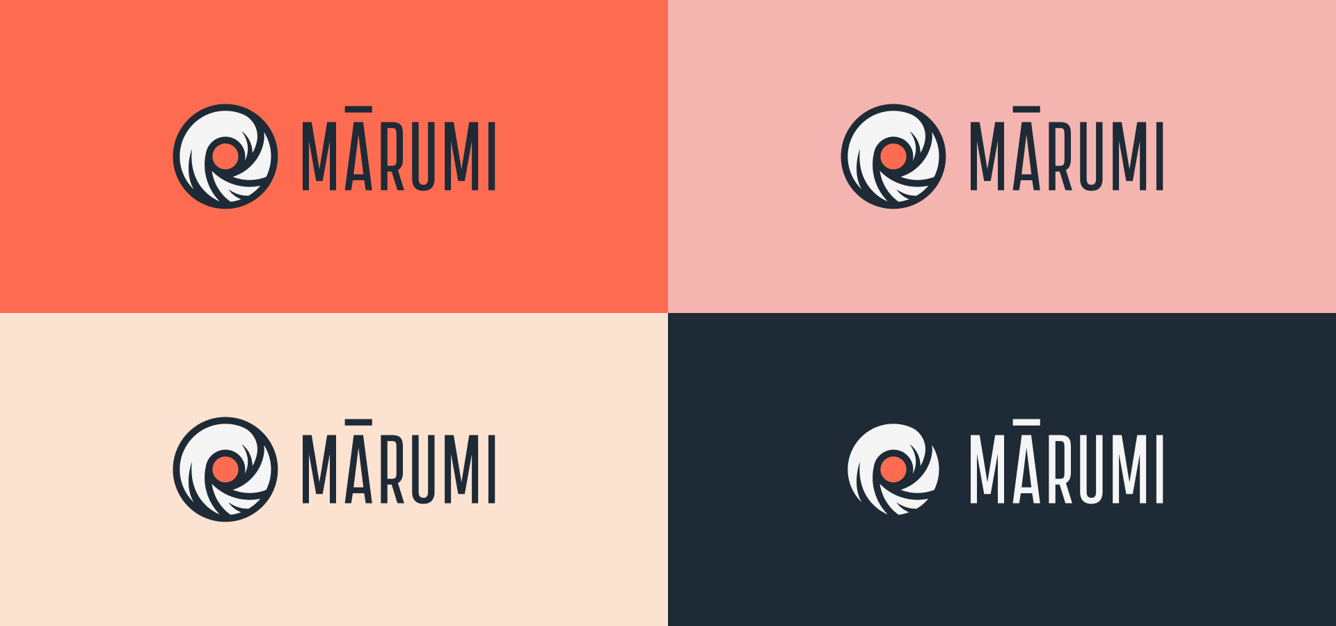
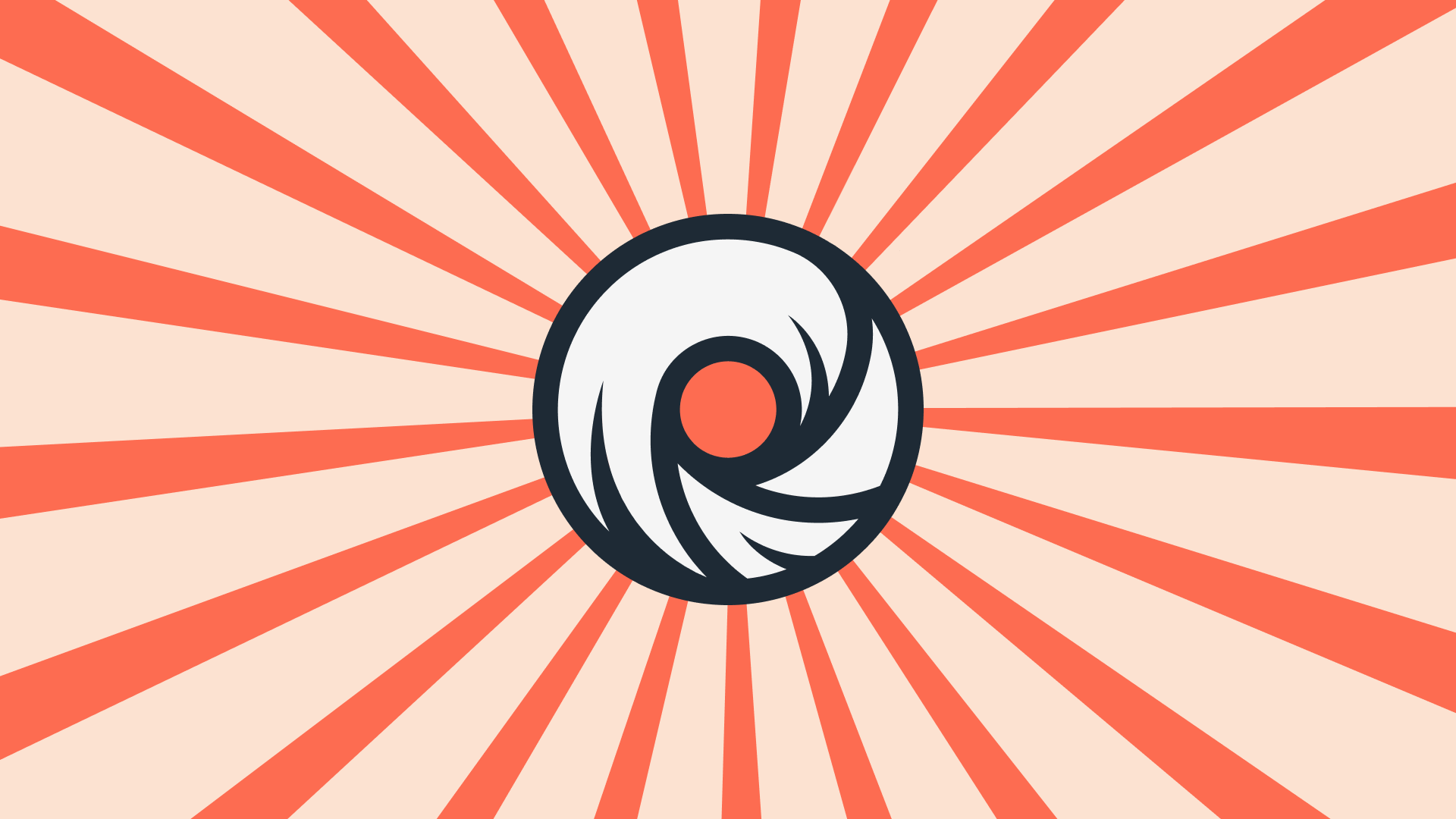
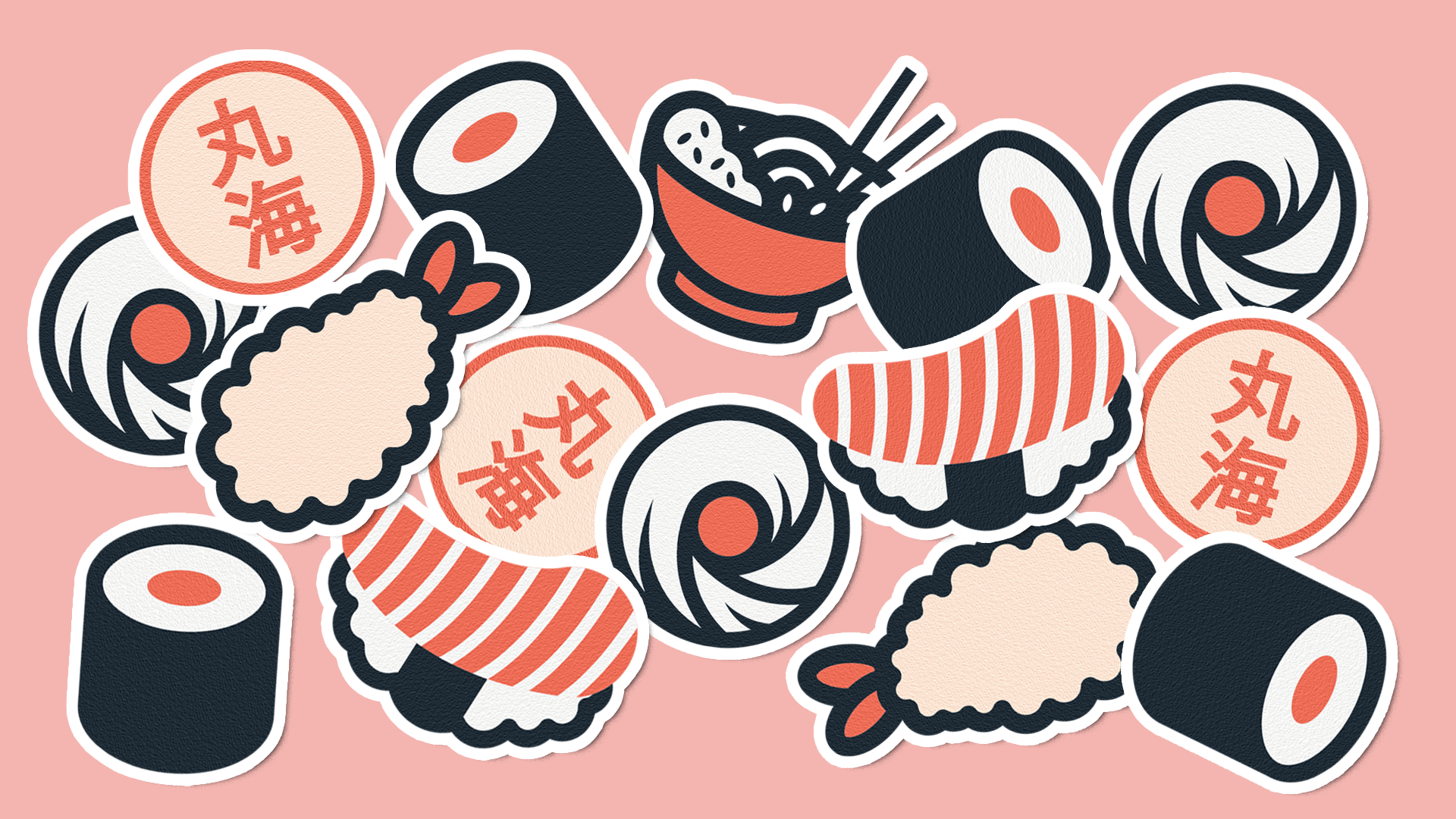
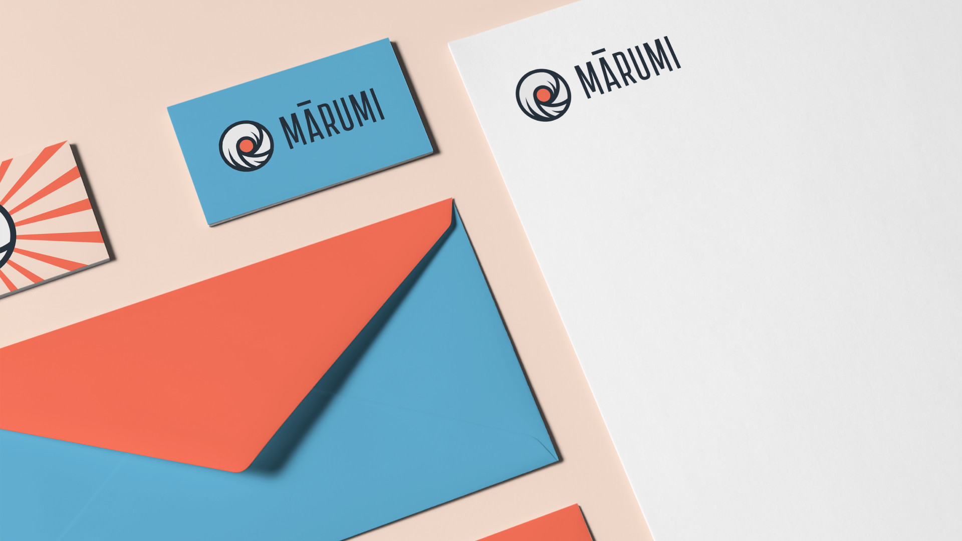
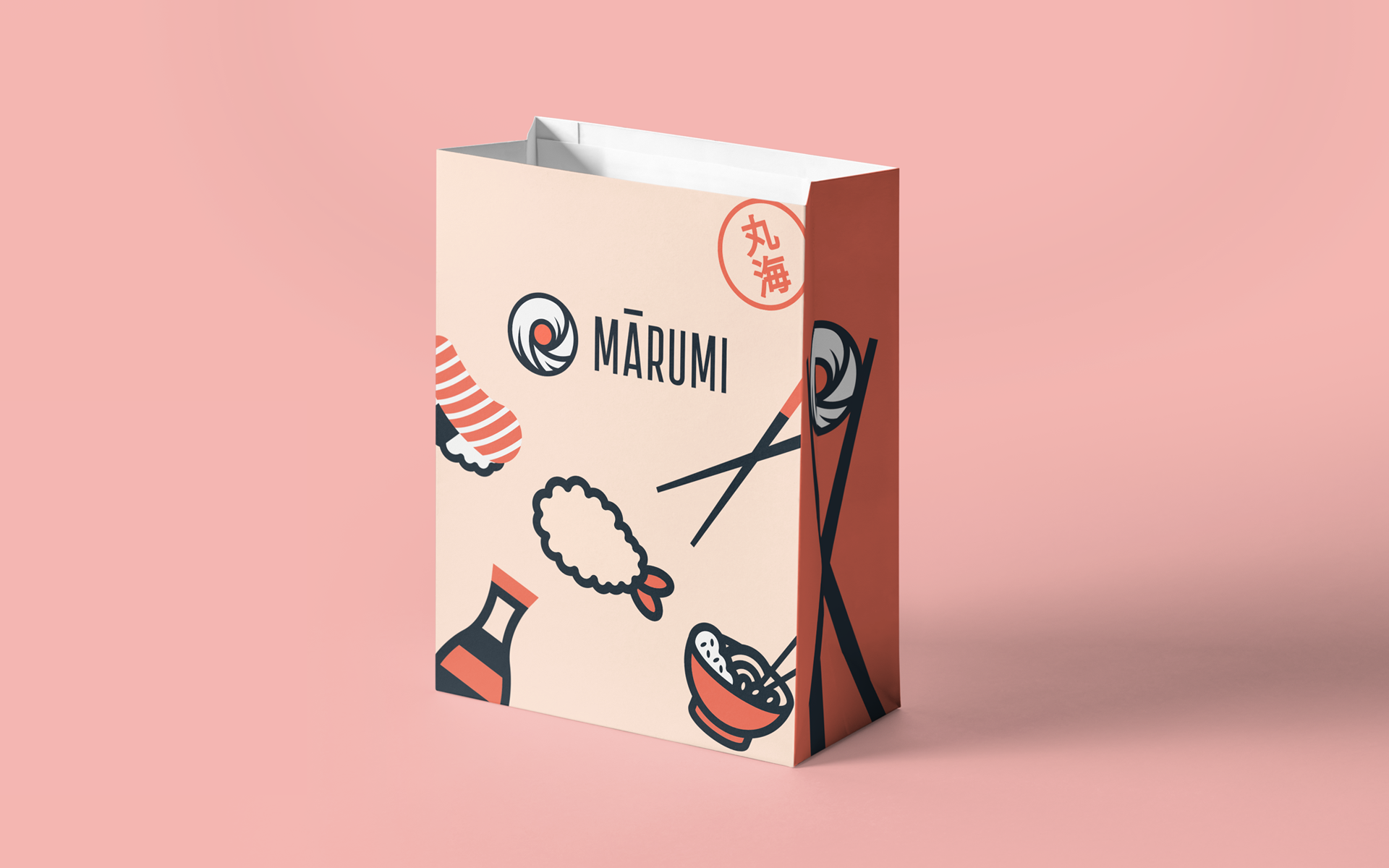
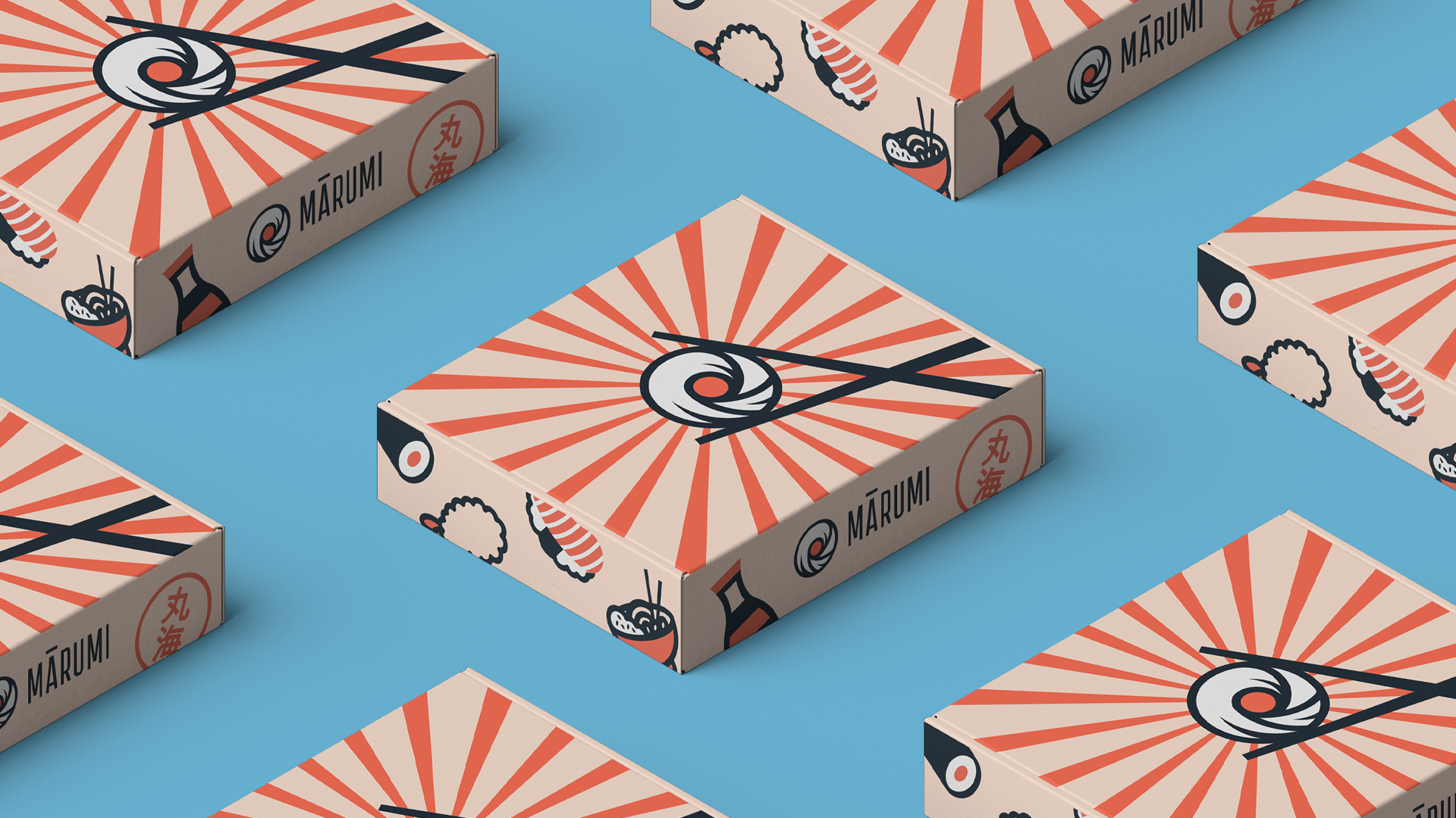
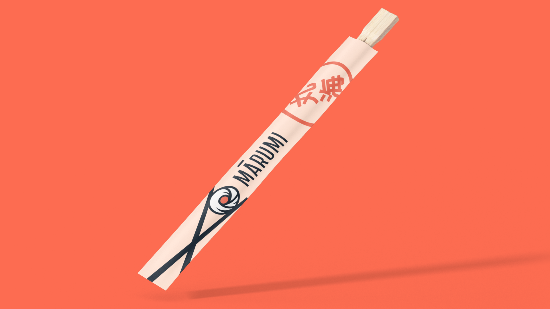
The name of the restaurant is made up of the word "mar" which comes from Spanish and "umi" from Japanese and they are both translated as "sea". Interestingly, the word "MARUMI" in Japanese means "circle" or "something round". For this reason, my final proposal for the logo was a roll + some maritime waves, typical of the city of Lechería.
I always wanted to work with the design of a sushi restaurant, so when this project came to me I wanted to give the restaurant a fresh and friendly face, opting to include kind of a “kawaii” illustration style and some Japanese elements, along with a color palette that could stand out.
This has been one of the projects where I've had the most fun because I had the creative freedom to let go, let my mind fly, and even illustrate a bit, always taking into account what was best for the brand.
Year:
2021
Client:
Marumi
What I did:
Art Direction, Graphic Design, Illustration & Packaging